Pristine – Caribbean Product Brand Launch
Client: Innovation Activators Limited, Trinidad and Tobago
How we took a household cleaning brand from vision to shelf-ready reality for the Caribbean Market
Pristine is a household cleaning brand created in Trinidad and Tobago, made for modern Caribbean homes. Eco-conscious, shelf-ready, and positioned to stand confidently alongside international competitors. When Innovation Activators Ltd. set out to launch the line, they needed a complete brand system that was clean, functional, and built for growth.
Focusing on clarity, care, and creativity, the Royalty Club team developed every touchpoint. From naming and identity to packaging, sales materials, and digital tools, we ensured Pristine launched with purpose and a professional edge. We helped bring this regional venture to life through full-scope branding and design support tailored for Caribbean markets.
The Brief
When Innovation Activators Ltd. approached us, their goal was clear: develop an environmentally conscious Caribbean cleaning brand that could stand proudly beside global competitors while remaining rooted in regional relevance.
The result was Pristine: a modern pod-based system for laundry and dishwashing, built on clarity, care, and creative execution.
Naming & Early Visual Language
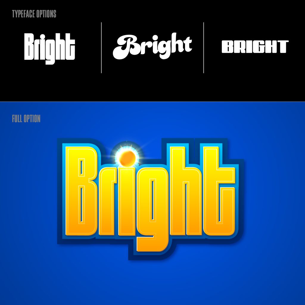
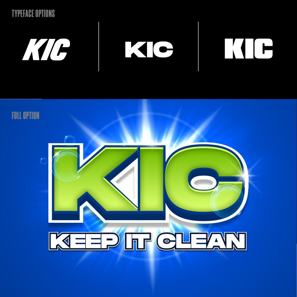
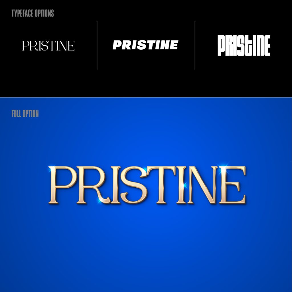
We explored a range of name directions—Bright, KIC, and ultimately Pristine—a name that conveyed both purpose and aesthetic. Each route was examined through font trials, colour tonality, and mood references to define a brand tone that felt fresh, credible, and memorable.
Logo & Wordmark Development
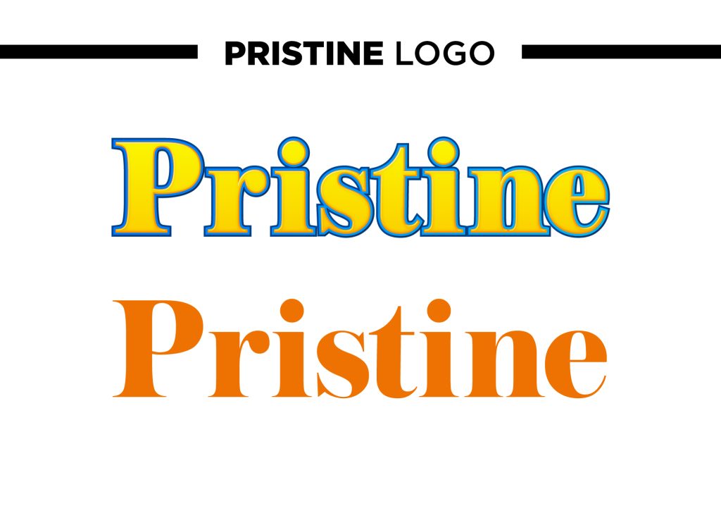
The final logotype is a clean, confident wordmark—set in Austin Cyr with custom adjustments for symmetry and softness. Designed for visibility on-shelf and ease of use in digital formats, it balances friendliness with clarity. We also explored minimalist variations for sub-brands and future product extensions.
Packaging System: Lemon Bliss & Island Breeze
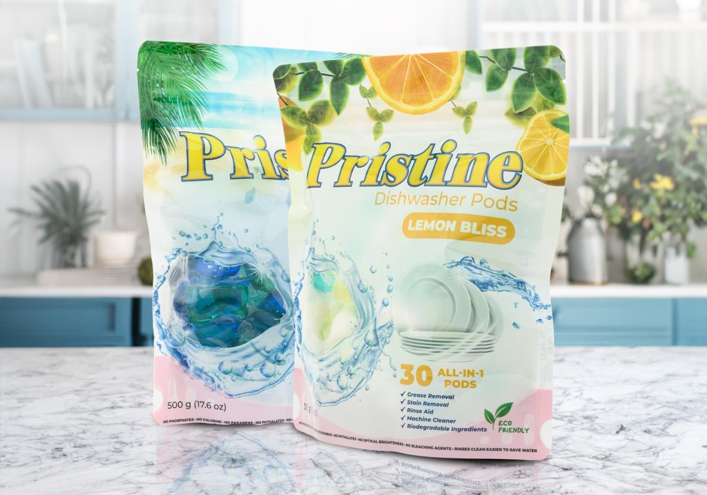
🟡 Dishwasher Pods – Lemon Bliss
Bright citrus accents and functional messaging highlight this 3-in-1 product’s purpose: degreasing, rinse aid, and machine cleaning.
🔵 Laundry Pods – Island Breeze
Ocean tones and splash graphics communicate freshness and biodegradability, with an emphasis on the 5-in-1 cleaning system.
Each packaging system included detailed dielines, ingredient callouts, sustainability icons, and consistent brand voice throughout.
Digital & Sales Toolkit
To support launch and distribution, we delivered a full suite of sales assets:
- A 4-page product catalogue for retail buyers
- A simple, modular landing page for product info and how-to guides
- Sample sachets for demos and trials
- Retail POS signage: shelf strips, “Now Sold Here” tags, eco-claim flash cards
Every piece was designed to scale—locally and regionally.
Brand Guidelines & Future Flexibility
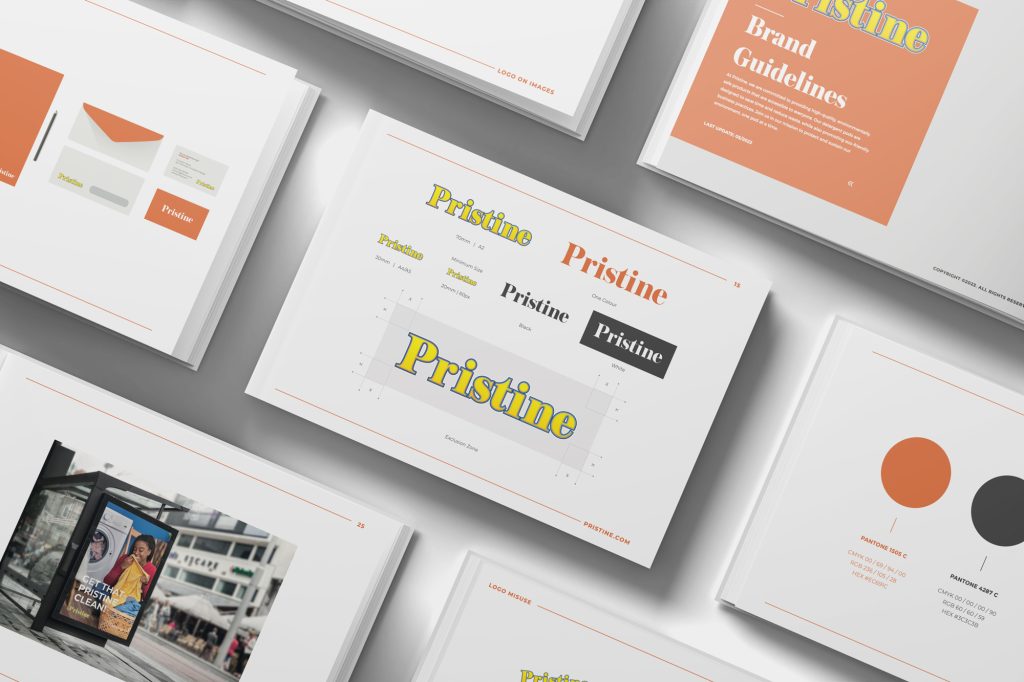
The final brand handoff included a complete PDF guideline covering:
- Logo usage and restrictions
- Colour and typography systems
- Verbal tone and messaging samples
- Rules for packaging, print, and web
Built for longevity and consistency across new product lines and markets.
Outcome
From ideation to implementation, Pristine reflects what’s possible when design meets disciplined execution. A regionally grounded brand with global visual standards—now prepped for growth.